General advice in various darkroom-focused groups on the internet tells us to only use the "middle" aperture of an enlarging lens, or alternately 3 stops down from wide open. It certainly is good advice, but how rooted in empiricism is it? What exactly do we sacrifice when we adjust up or down one f-stop? What about adjusting 2 f-stops? My goal in this post is to provide some discrete examples of those effects, as well as to compare the overall performance of some well-known enlarging lenses.
I compared 5 enlarging lenses, all of which have a 50mm focal length. They differ somewhat in aperture ranges, but I will describe them further below and explain my testing process. The lenses I tested are:
- Schneider-Kreuznach Componar f/3.5
- Schneider-Kreuznach Componon f/4
- Nippon Kogaku EL-Nikkor f/2.8
- Fuji Fujinar-E f/4.5
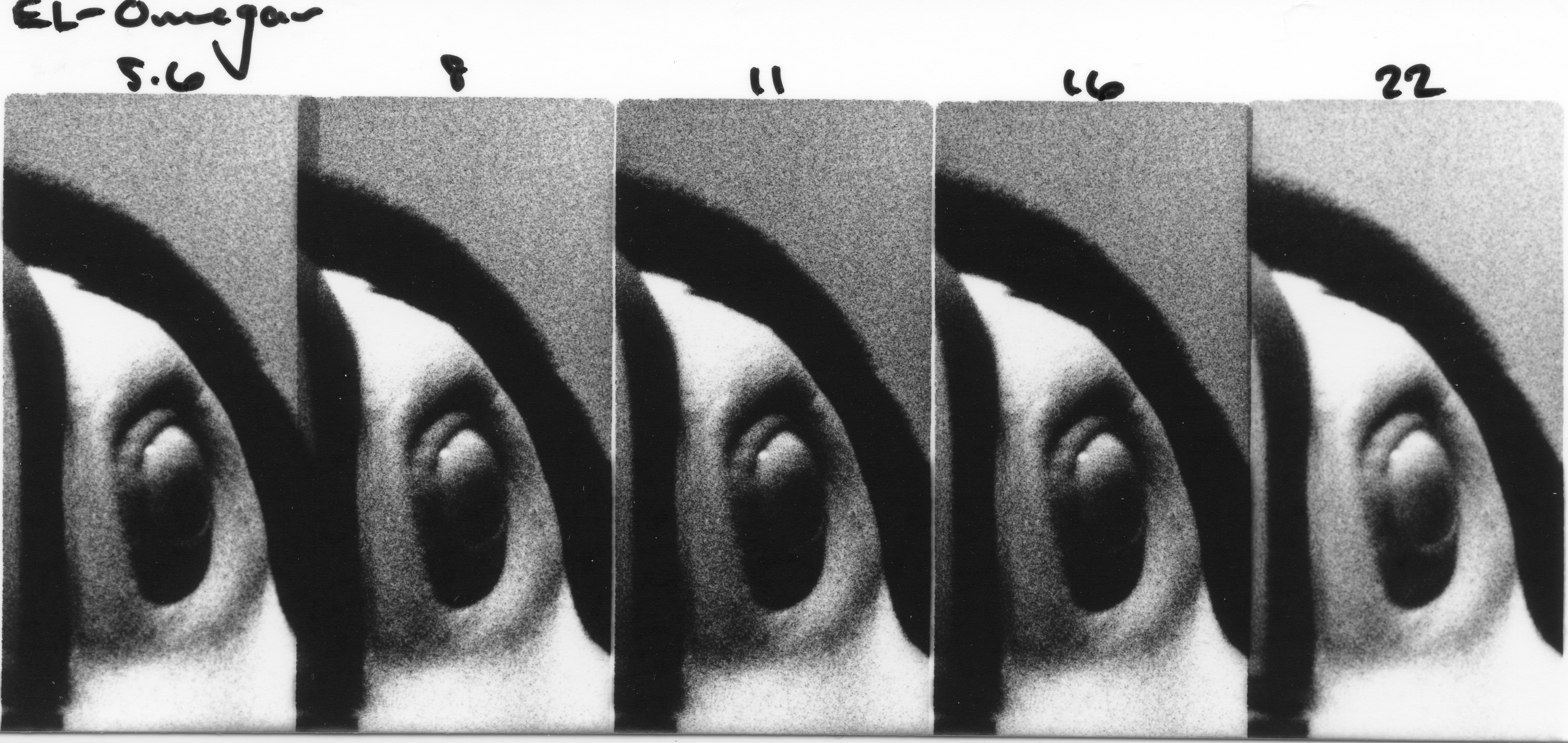
- Omega EL-Omegar f/3.5
Some of these lenses have impractically open apertures when used wide-open (looking at the EL-Nikkor f/2.8 in particular), therefore I tested the 5 smallest apertures on each lens, since these are the ones that will likely see the most use.
The negative I decided to enlarge for this test was a recent shot of a toucan at the zoo. I was pushing Kodak 5222 Double-X to 1600 just to see what kind of results I could get. The photo is deliciously grainy, a quality I was looking for in this series of tests because the sharpness of the individual grains will be more evident at different f-stops than the sharpness of the subject or overall image. I made a cropped 5x7 test print of the negative; the exposure was 32 seconds at f/11 using the Fujinar-E lens listed above. The projected image was approx. 10"x12", and I used a #2 Ilford contrast filter.
Testing Process
For my test strips, I cropped even further to include just the area around the toucan's eye and a bit of the blurred background. I focused all lenses at their most open aperture, and stopped down to make 5 different exposures per test strip, one exposure per aperture. I've labeled the apertures on each of the scanned test strips below, and I'll discuss the performance of each lens below the test strip.
Exposure times were extrapolated from the 32 seconds required for the test print and were used for all lenses:
f/4 - 4 seconds
f/5.6 - 8 seconds
f/8 - 16 seconds
f/11 - 32 seconds
f/16 - 64 seconds
f/22 - 128 seconds
Schneider enlarging lenses have a good reputation, and for very good reason. Each successive stop down, and therefore doubling of exposure time, is very consistent along the tested range. f/4 is a little bit soft, but the grains are sharper at f/5.6 and fully sharp at f/8 up to the smallest aperture of f/16.
Similar to the Componar above, the Componon performed excellently. Brilliant consistency across the aperture range, and very sharp from f/5.6-f/16. Not much else to say, it's quite obvious why Componon lenses are some of the most recommended.
The EL-Nikkor performed just about as well as the Componon. Very consistent, and also very sharp from f/5.6 and smaller. Perhaps at f/16 it appears slightly less sharp.
I made a small mistake with this test strip. I forgot to stop down to f/22 for the last frame, and with that requiring an additional 2-minute exposure, I decided to forgo making an entirely fresh test strip. Similar to the performance of the lenses above, the Fujinar is quite consistent in exposure time as it is stopped down, with a bit of softness wide-open. Apertures f/8-16 all seem useable.
Perhaps not surprisingly, the EL-Omegar performed quite poorly. The exposures on the test strip varied considerably, meaning that adjusting this lens up or down a stop does not give an equal exposure by halving or doubling the exposure time, respectively. The lens is at least reasonably sharp around the middle apertures, f/11 is certainly an acceptable exposure if this is the only lens available.
Conclusion
In conclusion, it would seem that the extreme apertures of most enlarging lenses are either sub-optimal in terms of image quality, or impractical in terms of required exposure time. The middle apertures of all the lenses produced acceptable results, and I think are very difficult to differentiate when analyzing prints. Choosing quality lenses will make adjusting exposure when stopping up or down easier, but it seems we have a lot more room to play with than initially thought!


